National Novel Writing Month is a 501c(3) non-profit. In November, they organize a challenge called National Novel Writing Month (aka NaNoWriMo). Creative Writing participants work for the month of November towards the goal of writing an entire 50,000-word novel within the month.
To celebrate their hard work, Debbie Millman organized a group of 30 professional designers to join the fun and participate in a project called 30 Days, 30 Covers. Each of us was challenged with creating a book cover design for one of the novels. Designers were provided with 3 synopses to select from on a Friday and given until Tuesday evening to complete our submission. The work was shared on the NaNoWriMo blog.
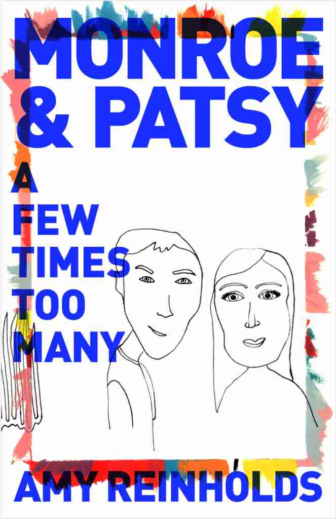
Monroe & Patsy (A Few Times Too Many)
by Amy Reinholds
Literary: music, coming of age, flashbacks, authenticity, love, fame
Young musicians coming of age in the early 2000s, with flashbacks to an earlier generation of influential musicians in their lives and families. Monroe wants to find the sweet spot where music can be part of his life, but insecurity and chasing celebrity do not control it. He is breaking away from the family ties of his charismatic, talented, and problematic uncle. Patsy seeks happiness and being comfortable with herself. A drive to be the best and to collect accolades propels her to achieve great things, to innovate and create music that speaks to people. But instead of seeking approval and fame, she needs to listen to the authentic voice that comes out when she plays music and expresses her true self.
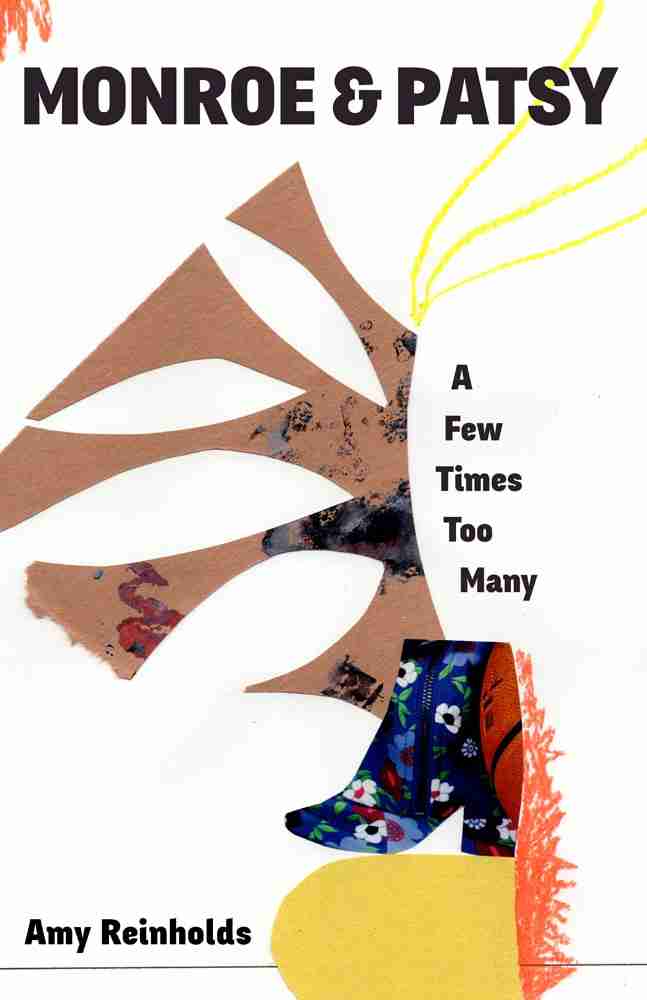
I created myself some canvases to collage on that included the synopsis for inspiration and an outline of the proportions as a guide.
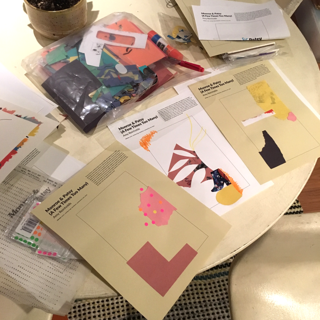
I scanned the collages and added to them with materials from my library.
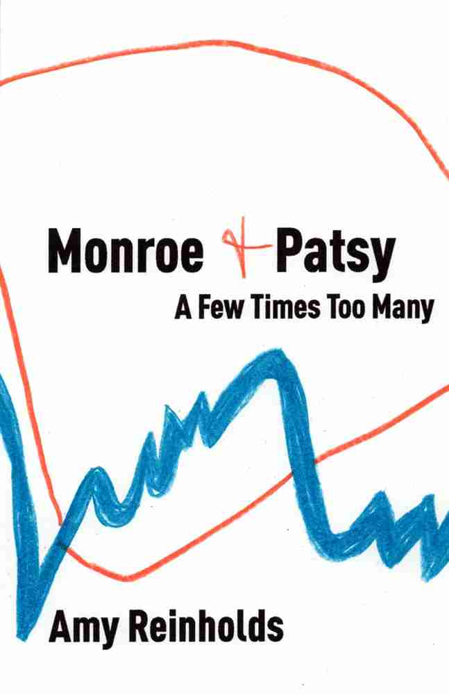
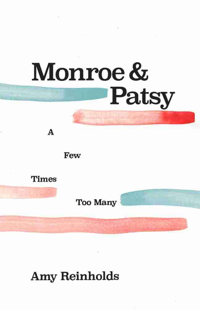
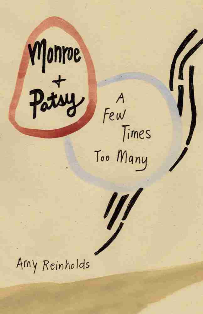
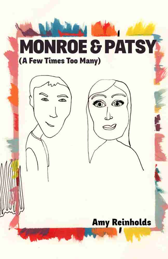
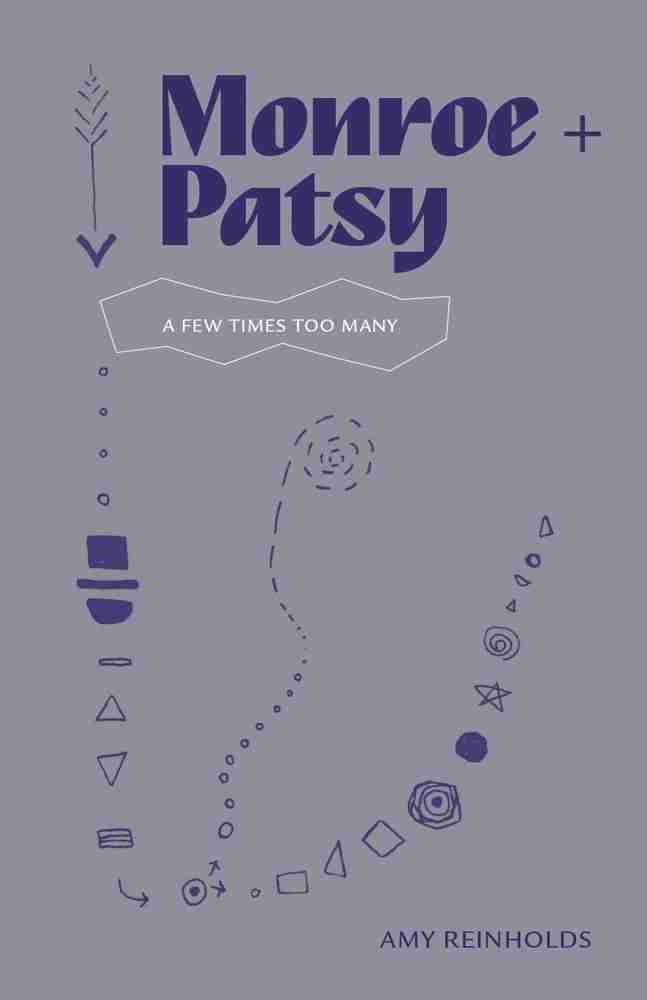
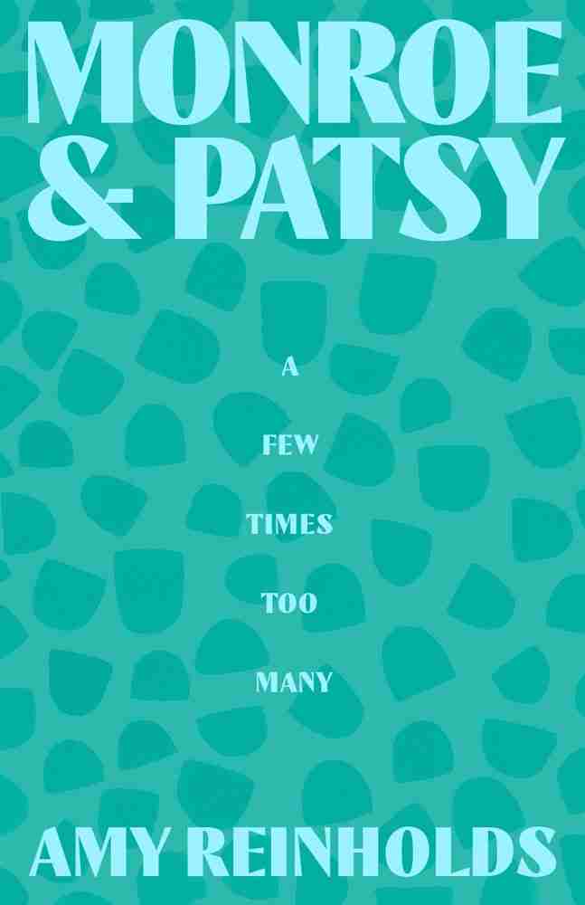
These are the options I came up with. Usually this is what I would send to the client and we would talk collaboratively about which directions speak to the author and represent the story best. I didn’t have that luxury in this case, so I sent them to a few friends for feedback and gave them some thought myself.
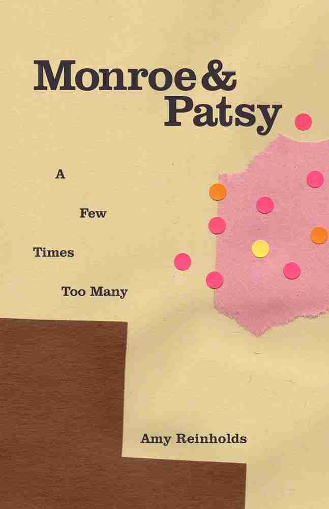
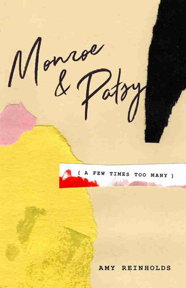


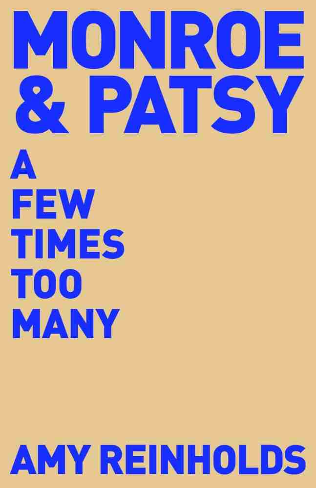
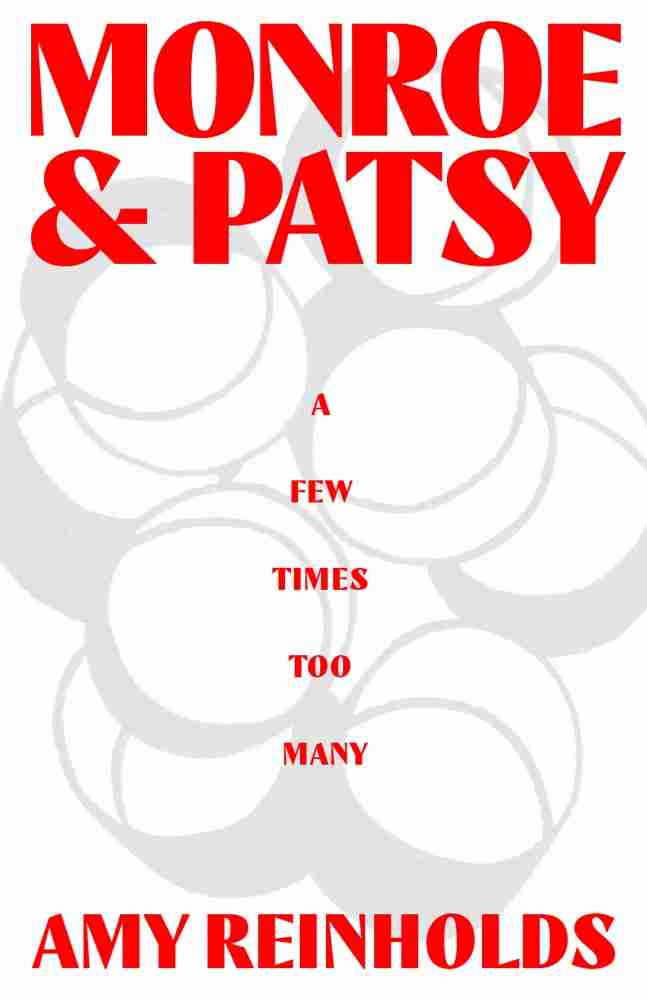
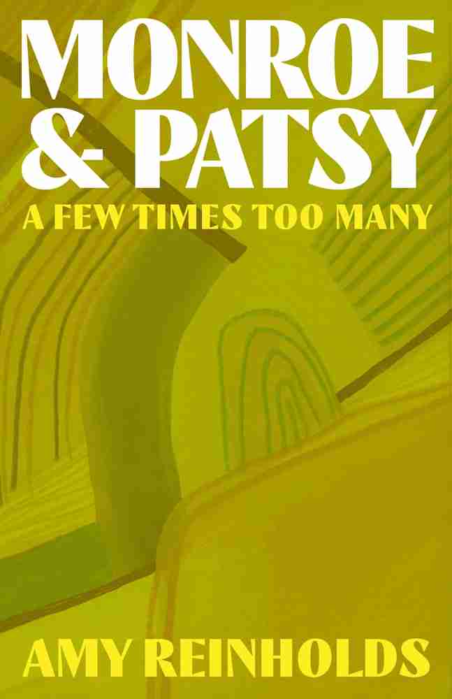
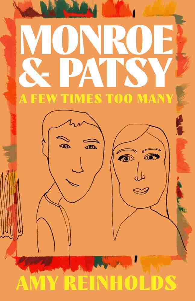
I settled on this direction – combining and refactoring some of the earlier studies. I was drawn to the boldness of the blue type (if this were actually getting produced, it would be amazing to overprint that with a spot color to get that vibrancy onto a bookshelf).
